All Courses
COMING SOON
COMING SOON
COMING SOON
More on RDD
When it comes to RDD, we can’t really compare everybody below the cutoff point to everybody above the cutoff point and call the difference in outcomes the causal effect. In our drinking-age example, we couldn’t compare 16-year-olds to 40-year-olds. We could only estimate a local treatment effect for drivers close to the cutoff.
So far, we’ve used the language of subjects “just” below and “just” above the cutoff to describe the bandwidth. But what constitutes “just” above or “just” below? How do we determine how wide the bandwidth should be?
Bandwidth selection
Bandwidth selection should be data-driven and should optimize a criterion such as the mean squared error or MSE. This criterion reflects a tradeoff between bias and variance of the RD estimate, and it’s important to understand why this tradeoff exists.
Imagine you choose a very narrow bandwidth. Back to the drinking age example, imagine you only looked at subjects who are 2 months younger or older than 21. The advantage of this narrow bandwidth is that your estimates would be more exact (less biased). You would have cut out much of the noise in the data i.e., the observations in treatment and control groups that are not comparable. However, two subjects who are 3 years younger or older than 21 are clearly very different. One might be in high school and the other might be in college. The narrower your bandwidth, the less biased your estimate is going to be.
On the other hand, because your sample is now very small, your estimate is going to be less representative of the general population and, therefore, you might have larger variances because of insufficient observations.
Now, if you do the opposite and choose a very wide bandwidth, you may introduce some bias in your estimates because the data is noisier. But, at the same time, your sample is more representative and the variance will be smaller. Remember, both lower bias and lower variance are desirable. This is a universal rule in statistics. The trouble is the tradeoff between the two.
MSE as a criterion for navigating this tradeoff is very simple.
This is a simple rule and can easily be computed. In fact, most statistical software perform bandwidth selection automatically. Let’s see how we can re-estimate the RDD treatment effect using an optimal bandwidth in our alcohol example.
# If you don't have the mortality data, load it again.
# mortality_data <- read.csv("https://bit.ly/carpenter_mortality")
# The package rdrobust estimates the bandwidth automatically.
# By default, the function rdrobust() automatically finds an optimal bandwidth
# and uses it in the estimation. However, we can first use the rdbwselect()
# to find the optimal bandwidth. Then we can use the bandwidth found
# in the rdrobust() or rdplot() function.
# Let's let rdrobust to decide the optimal bandwidth.
rdplot(y = mortality_data$alcohol, x = mortality_data$age, c = 21, nbins = 50, p = 1)
# Python codes will be added soon
rdplot alcohol age, c(21) nbins(50) p(1)
Fuzzy or not fuzzy?
Whether or not you’ve noticed, we’ve made a pretty strong assumption in the drinking age example. So far, we’ve assumed that the cutoff is binding. This means that the treatment received is fully determined by whether or not the subject is below or above the cutoff point. Drivers below the drinking age don’t drink and drivers above the drinking age do drink. This type of RDD analysis is called sharp RDD.
But obviously, this is not the way the real world works when it comes to drinking and driving. Many drivers below the drinking age drink and many drivers above the drinking age do not. Subjects that should receive the treatment because of the value of their running variable choose not to receive it and vice versa. There’s a modification of sharp RDD for this special case. It’s called fuzzy RDD.
In a fuzzy RDD, the cutoff rule is suggestive or enforced loosely. If you’re not already reminded, we’ll happily remind you that this is quite similar to the case of encouragement designs. In encouragement designs, the encouragement is only an “encouragement”; it isn’t binding. To calculate the treatment effect in encouragement designs, we had to use the LATE estimator using the Wald formula, which took the effect of encouragement on the outcome and divided it by the effect of encouragement on the treatment.
Similar to what we’ve seen in encouragement designs, in fuzzy RDD, we can find the effect of the treatment assignment on the outcome and divide it by the effect of treatment assignment on whether or not treatment is received. The result is the effect of treatment received on the outcome.
In fuzzy RDD, we need three variables. We need to know the running variable (here age), the outcome variable (mortality), but also we need a treatment status variable (whether or not the person actually consumes alcohol).
Because the three variables are in two different datasets and merging the two datasets requires a bit of data cleaning, we’ll just show a general case of how to do RDD in statistical software.
# This is only a pseudo-code and doesn't run.
rd_model_fuzzy <- rdrobust(y = data$outcome, x = data$running_variable,
										 fuzzy = data$treatment_status, c = 21)
summary(rd_model_fuzzy)
# Python codes will be added soon
* This is only a pseudo-code and doesn't run.
rdrobust outcome running_variable, fuzzy(treatment_status) c(21)
RDD: Some considerations
Now that we’ve gone over the nuts and bolts of RDD, it’s time to look at some important considerations when using RDD in your analysis. RDD is relatively simple in theory, but the implementation and the interpretation of your results have to be exercised with caution.
Are there really no differences between subjects just below and above the cutoff point?
One of the most important graphs in the pre-analysis phase of any RDD analysis is the density graph of the running variable. Why?
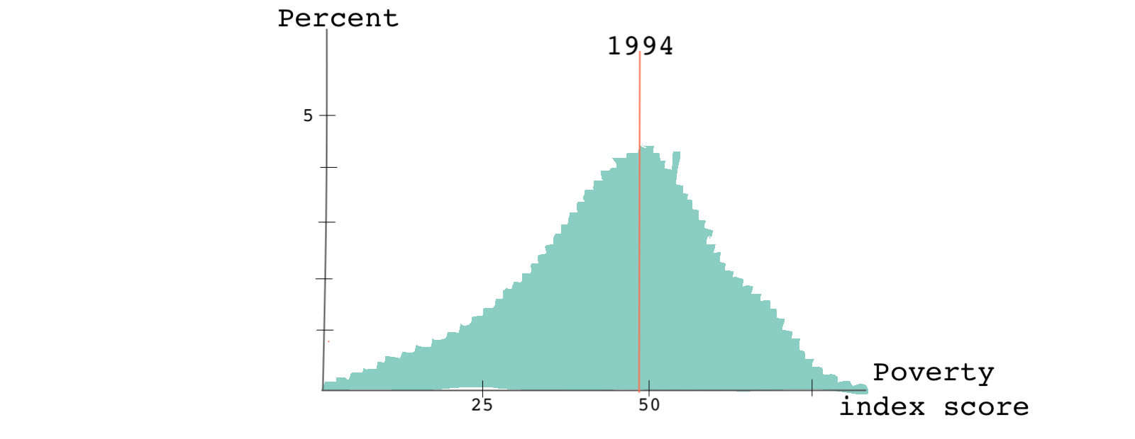
A paper by Camacho and Conover discusses the effect of a means-tested welfare program initiated by the Colombian government in the early 1990s. To identify who could qualify for the welfare program, the government used a poverty index reflective of employment status, income, demographics, and other characteristics of a household. The index ranged from 0 to 100.
The eligibility (or cutoff) rule was simple!
Families that scored below a 47 qualified for the welfare program. The poverty index was calculated every year for each family.
In 1994, when the program started, the distribution of the poverty index across the country looked like this:

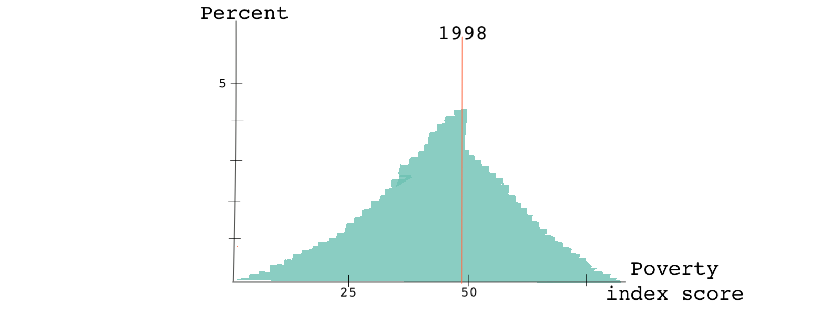
By 1998, when the program was in its fourth year of administration, the scores look like this:

While the distribution of scores in 1994 was smooth around the cutoff point, by 1998 there was a sharp discontinuity in the running variable exactly where the cutoff point was. What do you think happened?
The formula for calculating the poverty index hadn’t changed. But the information that people had about the eligibility rules and the poverty index had changed substantially. People learned how to game the system. Knowing how the index was calculated and understanding that their score needed to be below 47 to qualify for the program, some households intentionally disclosed family characteristics in a way that would make them eligible for the program. This behavior is referred to as bunching or sorting. It is also a good example of something called Goodhart’s law - when a measurement like a poverty score becomes a target, it ceases to be a good measurement since it will incentivize people to change their behavior.
Ok, but what does this have to do with RDD analysis?
In any causal setting, we like to assume that individuals don’t select into the treatment. Here, however, some families clearly self-selected into the treatment.
Looking at the distribution of the running variable helps us identify such discontinuities. Usually, we can prevent bunching if the exact cutoff is unknown to the subjects or can’t be manipulated by the subjects.
Is the cutoff used for another rule?
Leaving the bunching issue aside, let’s take a look at another potential problem. Imagine that in addition to determining who qualified for the welfare program, the cutoff rule of 47 was also used by the government to determine who qualified for different programs: food stamps (food vouchers) to children.
If we’re only interested in studying the effect of the first welfare program on children’s health outcomes, the fact that the very same cutoff rule is used for a second government program is problematic. The second program may also affect a child’s health outcome making it hard for us to disentangle the causal effects of one program from the other.
Higher-order polynomials are not always good
RDD estimates are based on fitting data before and after the cutoff. We can use a simple linear model or a fancy high-order polynomial model. However, our choice of the model may change the size and even the sign of the causal estimate (the jump at the cutoff point).
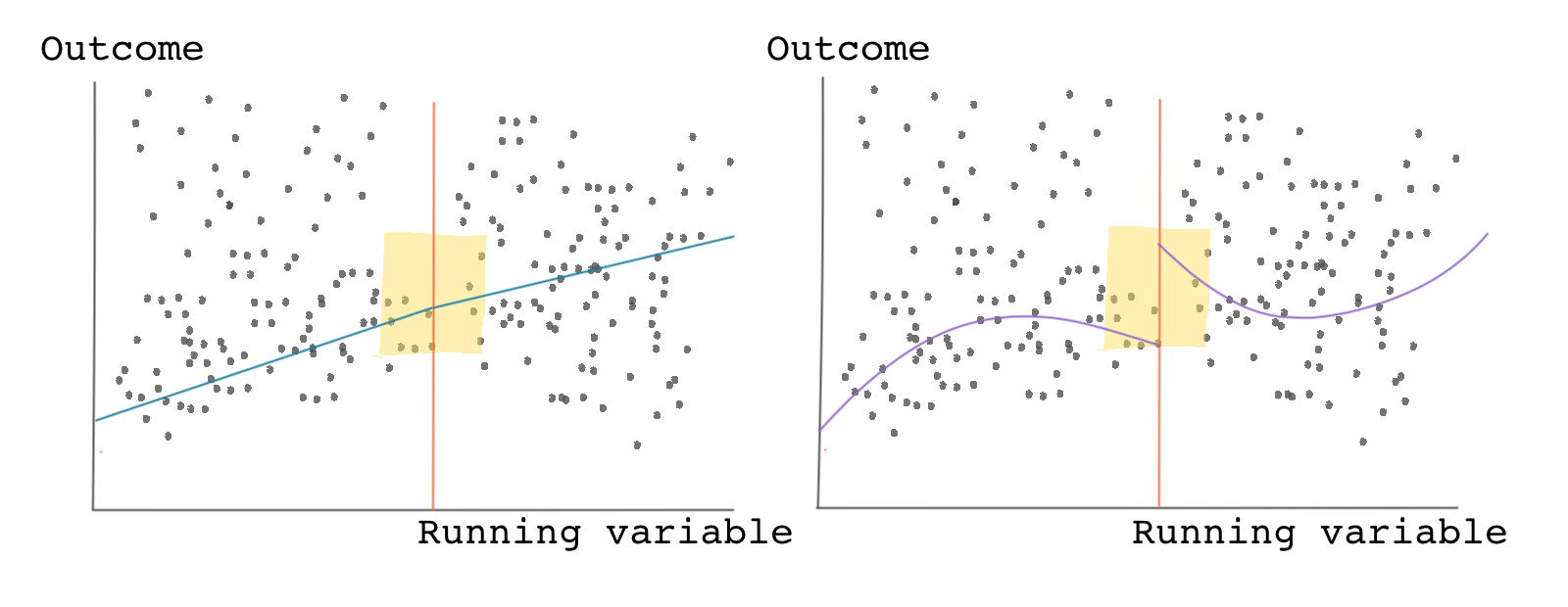
Look at the graph below! Both panels show the same data and show the scatter plot of the outcome variable against the running variable. The panel on the left shows a linear model fitting the data. It shows no jump at the cutoff. Based on this panel, we would conclude that the causal effect is zero.
But now look at the panel on the right-hand side. It fits a nonlinear curve to the same data. Based on this panel, we would be tempted to conclude that there’s a clear jump around the cutoff and a positive causal effect.

Which model is telling the truth?
In general, lower-order polynomials are better. Let’s see why!
RDD estimates are usually estimated as the difference between the weighted average of the outcomes of the treated observations versus the weight average outcomes of the control observations. As we saw earlier, narrowing the bandwidth reduces bias in the estimate because as we get closer and closer to the cutoff point, the comparisons become less noisy. Using a higher-order polynomial can sometimes mean that we’re giving higher weights to observations that are far from the cutoff point.
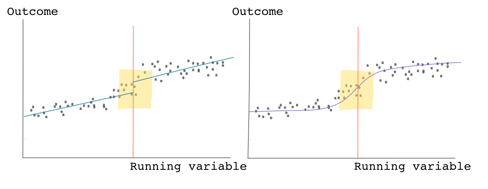
If there is clear nonlinearity in the data, we should avoid using a simplified linear fitting line, and use a non-linear model instead. For instance, in the graph below if we use a linear fit, we see a clear jump but when we use a nonlinear fit, we don’t. The data, however, shows a clear nonlinearity, therefore, it’s recommended to use the nonlinear model for estimating the RDD causal effect.

To be on the safe side, you can always take a look at your results with different specifications from linear to high-order nonlinear. If your results don’t change much regardless of the type of fitting curve you use, you should be happy. If, on the other hand, your results are highly sensitive to the order of the polynomial, you should be concerned about the validity of your estimates.
The sensitivity of RDD results to model complexity, bandwidth, and even bin widths have been, rightly, the focus of criticism against RDD.
Test the validity of your estimates
There are various tests you can do when it comes to RDD. These tests are designed to show that your results are robust and are not due to chance.
One of the most commonly used tests is called the placebo test, which we’ll see again in other applications such as when using synthetic control methods and difference-in-differences. The gist of the placebo test is to trick yourself.
In the study on minimum drinking age and mortality we saw a clear jump at the age of 21. This jump is because we knew even prior to our analysis that 21 (at least in the United States) is a special age. It’s when people can legally buy and consume alcohol. Ages like 20.5 and 22 aren’t special in the same way that 21 is.
The placebo test instructs you to trick yourself and choose a different cutoff point (like 22). Because 22 has no real significance (it’s not the real cutoff point), you shouldn’t find any jumps in the data. To administer a placebo test, you move the cutoff point to various points to the right and left of the original cutoff point and redo your analysis. If your initial results are robust, you shouldn’t find significant effects when running your placebo tests.
Generalizability of the treatment effect
Something that is usually overlooked in RDD is the generalizability or external validity of the treatment effects. In any type of causal inference study, external validity refers to the validity of applying the conclusions of a causal study outside the context of that study.
RDD compares outcomes locally around a cutoff point. So even if the causal effect is correctly estimated, the results are only applicable to the segment of the population within the bandwidth. Despite this being the whole point of RDD, it isn’t hard to find examples where the results of an RDD study are overextended and falsely used as evidence to make inferences about the broader population.
For instance, we started the previous lesson with the section title “alcohol and mortality.” This would be an overly ambitious and deceiving title for a paper using the type of RDD analysis we just went through. The title suggests a causal effect of alcohol consumption on mortality among the general population when the analysis only looked at drivers between the ages of 19-21.
The bottom line is this: you should be modest about how you frame your results. Don’t generalize! Don’t exaggerate! And be specific about the population to which your causal estimates apply.