All Courses
COMING SOON
COMING SOON
COMING SOON
Regression discontinuity designs
Regression discontinuity design, or hereafter RDD, is a specific type of natural experiment.
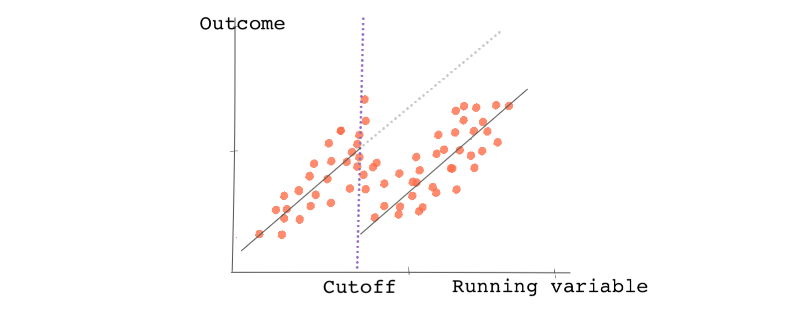
In RDDs, the sorting of a sample into treatment and control groups revolves around an arbitrary cutoff point. The cutoff point is considered arbitrary in the sense that it is exogenous with respect to the outcome being measured and it is not designated by the researcher. Let’s dig deeper!
Gotta love the cutoffs
Imagine we’re interested in the effect of college financial aid on college graduation. Are recipients of financial aid more or less likely to graduate from college?
To help answer this question we may consider writing a grant application to the Bill and Melinda Gates Foundation with the goal of conducting a randomized experiment. Using funding and random sampling we could select a group of high school graduates, award them a financial scholarship, wait a few years, and compare their outcomes to students in a control group. But could we also answer this question in a compelling way using observational data?
Let’s say there’s data on an existing educational scholarship that awards financial scholarships to students based on their high school GPA. The GPA cutoff point to qualify for the scholarship is a 3.0 (students with a GPA of 3.0 or higher are eligible for the aid and students with a GPA lower than a 3.0 are not).
The cutoff point here is arbitrary. The providers of the scholarship could just as easily have set the bar at a 2.95 GPA or 3.01 GPA. This is just the type of cutoff we are looking for. And as is the case with all natural experiments, it sorts our data into treatment and control groups without intervention by a researcher. In an RDD, the variable representing the cutoff is called the running variable. So, for this example, our running variable is GPA.
Now consider two types of students in the data. The first is a group of students whose GPA is just below the cutoff (with GPAs like 2.98 for example); the other is a group of students whose GPA lands right at or just above the cutoff point (with GPAs like 3.0 or 3.02). How do these two groups of students compare in terms of characteristics and expected outcomes? Would you expect average college graduation rates to be substantially higher in one group or the other?
Perhaps if we were comparing students with 4.0 GPAs to those with 2.0s, we would expect there to be big difference in outcomes and significant differences in unobserved and observable characteristics, but closer to our cutoff point, you’d expect the two groups to be quite similar. This is exactly what an RDD study takes advantage of. By comparing outcomes of students just below and just above the cutoff point, we can isolate and estimate the treatment effect of receiving the financial aid.
In this way, an RDD can closely but only locally replicate random assignment. Locally because we can only study those around the cutoff point without fully considering everyone in the sample.
Because the estimated effect in an RDD is local, we refer to it as the local average treatment effect or (LATE). Note the word local.
Assumptions, assumptions, assumptions
RDD relies on an important assumption called the RDD continuity assumption.
Assume that in an RDD everybody below the cutoff point receives the treatment and everybody above does not. The continuity assumption says that had the observations just below the threshold not received the treatment, the average potential outcome under no treatment would be a continuous line around the cutoff.

But what’s the problem? We can’t observe potential outcomes in order to test if the assumption is true. As a workaround, we test a particular interpretation of the assumption.
Another way to think about the continuity assumption is this: if the assumption holds, the observable and unobservable confounders do not jump abruptly at the cutoff (the group of students just above and just below a 3.0 GPA should not be particularly different in terms of their average characteristics). If the observable and unobservable confounders do not jump at the cutoff point, then in the absence of the treatment, the potential outcomes should not jump either. This is equivalent to randomized experiments where we assume the two groups (treated and untreated) are similar on average.
We can test this interpretation of the assumption using observable confounders. However, for the unobserved confounders, we can’t test the assumption, we can only back the assumption up with reasoning.
The rest is easy. If the continuity assumption holds, the only difference between the units on each side of the cutoff point within a reasonable bandwidth (or window) should be due to the treatment effect. In RDD the bandwidth refers to the range of subjects above and below the cutoff that are being compared. As we mentioned earlier, the estimated effect is called the local average treatment effect (or LATE) because it’s only informative of the treatment effect for subjects within the bandwidth.
Minimum drinking age as a running variable
We love examples. And there are so many examples to choose from when it comes to RDD. This one might be relevant to you if you are just below or above the minimum drinking age in your country. 🍻🍺
Imagine you’re given the task of studying the effect of alcohol consumption and mortality. There are various medical reasons why mortality would be higher under the influence of alcohol; for instance, due to overdosing and higher rates of suicide. Mortality under the influence of alcohol can also increase as a result of car fatalities due to blurred vision, compromised motor skills, increased aggression, and reduced inhibition. 😟
How would you go about answering this type of question?
Hopefully, your plan isn’t to run a randomized experiment. Such an experiment wouldn’t be ethical.
Although an RDD may not give you a comprehensive assessment of the effect of alcohol across all individuals, it may provide insights into a certain segment of the population. Most countries have strict laws prohibiting the sale of alcohol to people younger than a specific age. In the US, the minimum age for purchasing alcohol is federally enforced and is 21, but the minimum age to operate a vehicle is 16 or 18 depending on the state. This means that there is a subgroup of the population in the US who have limited access to alcohol that can be compared to those who are slightly older and are legally able to purchase alcohol.
In theory, by using the drinking age as a running variable you can split observations into those just below the drinking age and those just above the drinking age. Other than their greater access to alcohol, you would not expect the group just above the drinking age to be significantly different from the group just below in terms of driving experience and other relevant factors, so it’s a reasonable start to think that the continuity assumption holds.
Lucky for us, Carpenter and Dobkin have already thought about using an RDD in this exact and have provided data derived from two separate sources. For alcohol consumption, the data comes from the National Health Interview Survey (NHIS). The mortality data comes from the National Center for Health Statistics and is broken down by age group. The bandwidth for the study is young adults, aged 19-22.
Let’s directly load the NHIS dataset into your software like so:
# Let's load hte NHIS daya
nhis_data <- read.csv("https://bit.ly/carpenter_nhis")
import pandas as pd

# Let's load hte NHIS daya
nhis_data = pd.read_csv("https://bit.ly/carpenter_nhis")
nhis_data.head()```

```multi-stata
import delimited https://bit.ly/carpenter_nhis
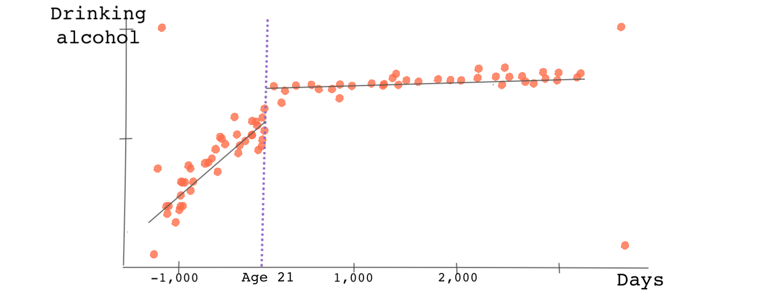
First, let’s check to see if the legal drinking age does in fact result in lower alcohol consumption for those younger than 21. To do this, we’ll need to plot alcohol consumption (drinks_alcohol) against the variable that captures days to the 21st birthday (days_21). Alcohol consumption is a binary variable. Most RDD packages do this kind of plot with fitting lines or curves.
# There are various packages in R for RDD. You can use the package rdd or
# the package rddtools. But rdrobust package is a good candidate.
# Let's load the package first
# first you need to install the package:
# install.packages('rdrobust')
library(rdrobust)

# Now, let's plot the RDD plot of the outcome againsts the running variable.
# c is the value of the cutoff point. nbins captures the number of bins
rdplot(y = nhis_data$drinks_alcohol, x = nhis_data$days_21, c = 0, nbins = 50, p = 1)
# The plotnine package and this code results in some warnings so we will remove them
import warnings
warnings.filterwarnings("ignore")
import plotnine as p

# Specify the treatment variable - if a person is above 21
nhis_data['D']=nhis_data['days_21']>=0

# This plot is not the best but it works for the purpose of this task
# Now, let's plot the RDD plot of the outcome againsts the running variable.
# p.geom_point plots the points, p.geom_vline plots the vertical line at cutoff,
# p.stat_smooth fits the regression, p.labs names the axes
p.ggplot(nhis_data, p.aes(x='days_21', y='drinks_alcohol', color = 'factor(D)')) +    p.geom_point(alpha = 0.5) +    p.geom_vline(xintercept = 0, colour = "grey") +    p.stat_smooth(method = "glm", se = 'F') +    p.labs(x = "Days (X)", y = "Drinking alcohol (Y1)")```

```multi-stata
* For our RDD analysis we use rdrobust package in Stata.
* Install the package first if you haven't done it yet:
* ssc install rdrobust, replace

* Now, let's plot the RDD plot of the outcome againsts the running variable.
* c is the value of the cutoff point. nbins captures the number of bins
rdplot drinks_alcohol days_21, c(0) nbins(50) p(1)
The plot below is what we get.

Note that this is a binned scatter plot meaning the number of days to an individual’s 21st birthday are binned and averaged within each bin. The slopes of the lines before and after the cutoff point are different. This is because we use different regression models for each side of the cutoff point.
There is clearly a jump at the cutoff point suggesting that those just below the minimum drinking age consume less alcohol than those just above it. The treatment effect is the distance between the lines at the cutoff point. Young adults just above the cutoff point are approximately 10 percent more likely to consume alcohol compared to counterparts just below the drinking age.
It’s recommended that we start with a simpler linear fitting line but try playing with the number of bins or the order of the polynomial fitting curve. Here, interestingly, the result (the jump in alcohol consumption) doesn’t change much.
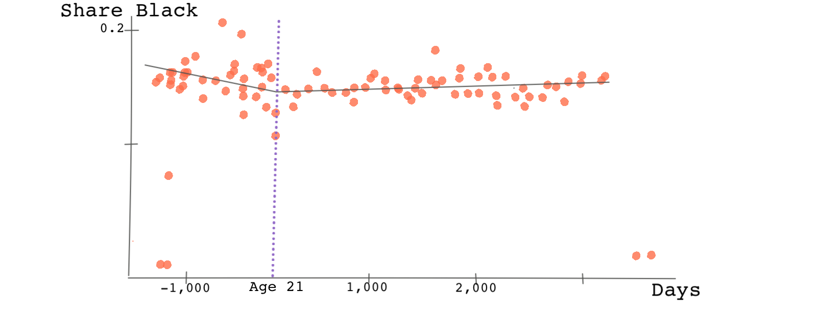
Remember, one of the assumptions of RDD was that there shouldn’t be any discontinuity at the cutoff point when we plot the observed confounders against the running variable. This is because we’re assuming that those just below the cutoff point and just above the cutoff point should be, on average, similar. Let’s take a look at one such characteristic: the probability of being black.
# Now, let's check for any discontinuity at the cutoff point for the covariate
# black which shows whether the person has a high school diploma.
# we just have to replace the y variable with the covariate.
rdplot(y = nhis_data$black, x = nhis_data$days_21, c = 0, nbins = 50, p = 1)
# Now, let's check for any discontinuity at the cutoff point for the covariate
# black which shows whether the person has a high school diploma.
# we just have to replace the y variable with the covariate.

p.ggplot(nhis_data, p.aes(x='days_21', y='black', color = 'factor(D)')) +    p.geom_point(alpha = 0.5) +    p.geom_vline(xintercept = 0, colour = "grey") +    p.stat_smooth(method = "glm", se = 'F') +    p.labs(x = "Days (X)", y = "Share Black (Y1)")```

```multi-stata
* Now, let's check for any discontinuity at the cutoff point for the covariate
* HS_dimploma which shows whether the person has a high school diploma.
* we just have to replace the y variable with the covariate.
rdplot black days_21, c(0) nbins(50) p(1)

Do you see any discontinuity? We don’t! 🤷🏽♂️ Check other confounding variables such as high school diploma on your own. Is the RDD continuity assumption violated?
Finally, let’s look at the main outcome variable. For this, we need to load the mortality data. In this data, the variable AGE is in decimals. The data contains mortality rates per 100,000 by age overall and broken down by primary cause of death including alcohol.
# Now, let's load the mortality data
mortality_data <- read.csv("https://bit.ly/carpenter_mortality")
import pandas as pd

# Now, let's load the mortality data
mortality_data = pd.read_csv("https://bit.ly/carpenter_mortality")
* Now, let's load the mortality data
import delimited https://bit.ly/carpenter_mortality
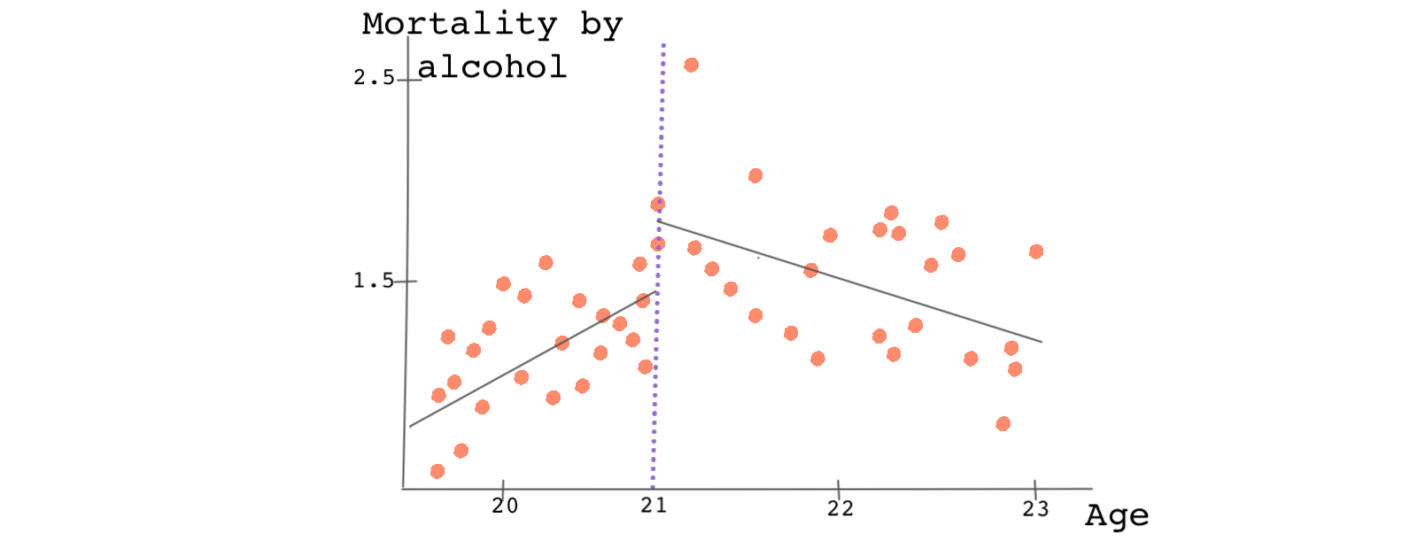
Try plotting mortality caused by alcohol against the running variable age.
# We plot the RD plot with mortality caused by alcohol as the outcome variable
# and age as the running variable. Note that here age is in years and therefore
# the cutoff point should be 21.
rdplot(y = mortality_data$alcohol, x = mortality_data$age, c = 21, nbins = 50, p = 1)
# We plot the RD plot with mortality caused by alcohol as the outcome variable
# and age as the running variable. Note that here age is in years and therefore
# the cutoff point should be 21.

mortality_data['D']=mortality_data['age']>=21

p.ggplot(mortality_data, p.aes(x='age', y='alcohol', color = 'factor(D)')) +    p.geom_point(alpha = 0.5) +    p.geom_vline(xintercept = 21, colour = "grey") +    p.stat_smooth(method = "glm", se = 'F') +    p.labs(x = "Age (X)", y = "Mortality by alcohol (Y1)")```

```multi-stata
* We plot the RD plot with mortality caused by alcohol as the outcome variable
* and age as the running variable. Note that here age is in years and therefore
* the cutoff point should be 21.
rdplot alcohol age, c(21) nbins(50) p(1)

There is a jump in the outcome of about 0.5 deaths per 100,000 and this jump can be attributed to the treatment variable, access to alcohol.
What if we didn’t see any discontinuity?
If the graph representing the relationship between the outcome variable and the running variable doesn’t show evidence of a discontinuity at the cutoff point, there’s little chance that we’ll find any statistically significant evidence of a treatment effect.
However, it may be that we need to change the bin widths or include interaction or nonlinear terms. In adjusting the widths of each bin, we should avoid bins that are too wide or too small. Small bin widths render a noisy RDD plot and the relationship between the outcome variable and the running variable will be hard to see. If the bin widths are too wide, we won’t have enough observations to fit the regression lines. There are some cases that the data clearly suggest that we should use a higher-order polynomial to fit the data before and after the cutoff point. There are also algorithms for finding the right bin widths.
However, if the plot shows that we should use a higher-order polynomial due to nonlinearity in the data, we should change the functional form. In general, you’ll be surprised that the bin size and order of the polynomials can greatly affect the size and even the sign of the treatment effect.
We can also estimate the RDD treatment effect analytically without looking at a plot. This can be done using most RDD packages.
# The following finds the RDD treatment effect
rd_model <- rdrobust(y = mortality_data$alcohol, x = mortality_data$age, c = 21)
summary(rd_model)
import statsmodels.api as sm
import statsmodels.formula.api as smf

# The following finds the RDD treatment effect
formula = 'alcohol ~ age*D'

regression = sm.OLS.from_formula(formula, data = mortality_data).fit()
regression.summary()```

```multi-stata
* The following finds the RDD treatment effect
rdrobust alcohol age, c(21)
As you can see, the local average treatment effect is 1.015. We can interpret this as saying: the mortality rate increases by almost 1 in 100,000 as a result of alcohol consumption (or more specifically, due to greater access to alcohol). This number is slightly different than the one we found from the plot which is due to the different order of the polynomial or different bin widths.
Note that we haven’t yet discussed how to select the window of observations, the bandwidth. This is an important step and needs to be discussed in detail. We’ll talk about this in the next lesson.